Improving Uncertainty Visualization in ENCs
Towards a Better Portrayal of Bathymetric Data Quality for Mariners
The visualization of bathymetric data and associated uncertainty in electronic nautical charts (ENCs) is important when it comes to planning and monitoring a ship’s route safely. However, a study confirmed that the current uncertainty representation is not very intuitive and does not provide clear orientation for mariners. To improve this situation, Fraunhofer IGD proposed novel visualization solutions for the next-generation S-101 ENC standard. Read on for a summary.
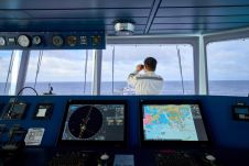
Electronic nautical charts (ENCs) are common tools for safe navigation at sea. By providing information concerning water as depth zones, contours and spot soundings, they support mariners in planning routes, which maintain under keel clearance during the entire voyage. However, considering charted depths figures only for this task is not sufficient. Known or presumed uncertainties associated with the underlying bathymetric data must be taken into account too, as this may lead to critical deviations of the charted depths and the real depth at a certain position and point in time.
The sources contributing to such uncertainty are well known. They include limited accuracy, resolution and precision of sensors, environmental influences like tides, wind, wave height or dynamic seabeds, as well as incomplete surveys of marine areas. To make mariners aware of the data imperfections and to increase the credibility and expressiveness of the ENC, a dedicated uncertainty visualization is useful. This can facilitate informed decision-making and avoid running aground in the worst case.
Current Situation
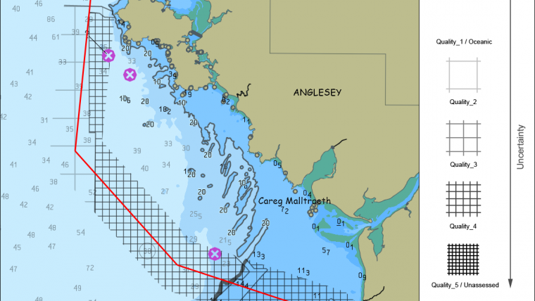
Despite the fact that uncertainty visualization is a well-researched area within information visualization and cartography, visualizing uncertainty associated with bathymetric data in ENCs has not been addressed sufficiently yet. Although a standardized solution for visualizing the composite quality indicator ‘Category of Zone of Confidence’ (attribute CATZOC) exists in IHO’s ENC standard S-52 (see Figure 1 for an example), a study by Harper et al. confirmed, that this kind of representation is difficult to understand for mariners and thus is rarely used. Moreover, it has been indicated that CATZOC itself has limited expressiveness. Consequently, the development of better quality indicators and visualization techniques have been an issue for many years within the respective standardization committee and working groups of the International Hydrographic Organization (IHO).
After several iterations, IHO’s Data Quality Working Group introduced a more comprehensive composite quality indicator called ‘Quality of Bathymetric Data’ (QOBD), which is going to become a standardized attribute in the next generation ENC specification S-101. QOBD categorizes surveyed areas in one of the following classes: Quality_1 – Quality_5 (from low to high uncertainty), Oceanic (areas far offshore which are considered as adequately safe for navigation) and Unassessed.
The efficient visual representation of uncertainty including QOBD in ENCs is still an open research question. A major difficulty are ENCs themselves. They already represent a multitude of information in a complex way and utilize a large number of different visual communication channels. This does not only limit the possibilities of visualizing uncertainty, it also makes it difficult to meet representation requirements like intuitive readability, consistency of the visual encoding and prevention of visual clutter as well as ambiguities. Fraunhofer IGD conducted a study concerning this issue in 2016 and proposed novel solutions in this regard, which are summarized below.
New Ways of Visualizing Uncertainty
Based on an in-depth literature review in the research areas of information visualization and cartography, a large variety of existing techniques for visualizing uncertainty were identified. To check their applicability, a list of requirements for representing uncertainty of bathymetric data in ENCs was compiled. For doing so, the ENC representation standard S-52 as well as previous work on this topic by IHO’s working groups were examined. Important requirements are:
- Simultaneous representation of depths and associated uncertainty
- Avoidance of visual clutter
- Intuitive and unambiguous visual encoding
- Matching colours for the ECDIS modes day, dusk and night
By taking these and further requirements into account, Fraunhofer IGD made proposals with regard to three aspects.
Data Pre-processing
In order to avoid visual clutter and information overload it is not possible to visualize all individual aspects of uncertainty at the same time. Instead, the representation of a quantitative or qualitative aggregation of aspects of uncertainty is proposed.
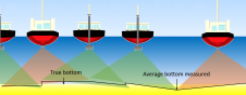
With a quantitative aggregation, the maximal deviation of a measured depth at a specific location (e.g., +/- 2m) can be described for a certain point in time. This deviation could then be visualized either in combination with the depths themselves, or in the form of corrected minimal depths. Although this approach would provide valuable information to mariners, it is still difficult to realize, especially the quantification of potential changes over time. This requires suitable and complex forecast models for dynamic seabeds, tides and wave heights which may not exist for many sea areas.
When it comes to aggregate uncertainty in a qualitative way, there are many possibilities. However, it is not entirely clear, which information should be included and how they should be weighted. CATZOC and QOBD are two existing examples. Visualizing such composite, qualitative indicators enable mariners to get a rough overview of existing uncertainty, but do not provide precise information. This can still be enough to decide in favour of or against a certain route.
Area of Interest
Information concerning uncertainty of bathymetric data are typically required for certain areas of interest, not the entire map. This makes it possible to restrict the uncertainty visualization locally, which in turn helps to avoid visual clutter. The area of interest depends on the use case. For route planning, it is a corridor along potential routes. In monitoring scenarios, nearby waters are of interest, for instance when a planned route must be left in case of an emergency. Thus, the visualization should be confined locally to a circular region around the ship‘s position. The radius of this area should be calculated based on a reaction time set by the mariner and the current speed of the ship. Assuming a ship is travelling with 20kn and the reaction time is set to 30min, the radius of the circular area should be 10nm.
Visual Encoding
In the study by Fraunhofer IGD, novel concepts for visualizing the qualitative indicator QOBD as well as an aggregated quantification of uncertainty have been developed.
For visualizing QOBD, an optional ENC layer is added, so that bathymetric data, geo-spatial reference and uncertainty can be viewed together. For encoding individual QOBD classes, a hierarchical texture overlay with varying hierarchy level and transparency is proposed:
- Quality_1/Oceanic: 100% transparency, hierarchy level 0
- Quality_2: 75% transparency, hierarchy level 1
- Quality_3: 50% transparency, hierarchy level 2
- Quality_4: 25% transparency, hierarchy level 3
- Quality_5/Unassessed: 0% transparency, hierarchy level 4
As a basic assumption, Quality_1 and Oceanic as well as Quality_5 and Unassessed are visualized identically as they provide semantically similar information. The colour of the texture is selected depending on the current ECDIS mode. In day mode, black is used, whereas two different shades of grey are utilized in dusk or night mode. As a suitable type of texture, a regular grid is recommended. For further support of the visual separation of areas with different QOBD class, outlines are added. The overall impression produced by this kind of visual encoding is: the clearer the depth representation, the better the data quality. Figures 2 and 3 exemplify the visualization for a fictitious route planning and monitoring scenario in ECDIS modes day and dusk. Since a classification of waters according to QOBD does not exist yet, the CATZOC classification was used as a basis for these images.
Assuming that the uncertainty can be quantified appropriately, the researchers propose to compute areas that are potentially unsafe for navigation (i.e., areas where the depth plus uncertainty may fall below the safety contour threshold) and to add a respective visualization. The adaption of the safety contour to an area representation would be a suitable example. This would communicate additional information and increase the ENC‘s expressiveness. The thick grey line (area) on the bottom part of the route’s corridor in Figure 2 gives an example.
With these solutions, Fraunhofer IGD aims to increase the safety when navigating at sea.
For further details, the interested reader is referred to the original study.
More Information
- S. Harper, D. Wells, and K. Gunning. The Development of New Data Quality Visualisation Methods in Electronic Chart Information Systems and Investigation into Associated User Response. Hydro12 - Taking care of the sea, 2012.
- Gladisch, T. Ruth. Study DQV - Data Quality Visualization: Recommendations for Visualizing Uncertainty in electronic nautical charts. Fraunhofer IGD, Rostock, 2016.
Value staying current with hydrography?
Stay on the map with our expertly curated newsletters.
We provide educational insights, industry updates, and inspiring stories from the world of hydrography to help you learn, grow, and navigate your field with confidence. Don't miss out - subscribe today and ensure you're always informed, educated, and inspired by the latest in hydrographic technology and research.
Choose your newsletter(s)